Problem
How might we clarify Vendor Box’s brand and website to ensure users understand the value of our product while building trust and credibility?
Feedback from usability testing highlighted confusion around Vendor Box’s identity, with many mistaking it for a consultancy rather than an AI-driven product. Additionally, the lack of emphasis on tangible outputs, like our recommendations, raised questions about trustworthiness.
Stakeholders
Defining the scope
Users often misunderstood our offerings, mistaking us for a consultancy rather than a product. This confusion prompted a research study to validate our assumptions and gather actionable insights. The findings prompted us to do the following:
We wanted to update the messaging around
Users were unsure what they were paying for, so now we make it clear by showcasing tangible deliverables, like the recommendation report.
To complete the experience of being a tech product, we wanted to highlight the modern, AI-driven aspect of the brand.
What we found out
We conducted a usability test where we asked 4 participants to go through the website. We focused the test on their impressions of branding, service clarity, and trustworthiness of the website and sign-up process.
Participants associated the website and brand design with consultancy rather than a product offering.
The sign-up questionnaire was straightforward, but users felt uncertain about next steps post-submission.
Users appreciated the service-specific quizzes but wanted more emphasis on what they would actually be receiving.
Finding our direction
Although we don’t have competitors that do the same exact thing, we took inspiration from adjacent tools that specialized in AI such as Jjasper.ai, Grammarly, etc. Here’s what we extracted from that:
Subtly emphasize AI like Jasper, using abstract visuals or light animations to convey innovation without being overwhelming.
Like Grammarly, focus on benefits (“Find the perfect CRM”) rather than technical explanations.
Hi-Fidelity updates
Once our direction was established, we used as much as we could from the existing branding and repurpose it to create the branding that would be most relevant to our target audience.
Requirement #1
Clearly position Vendor Box as a product
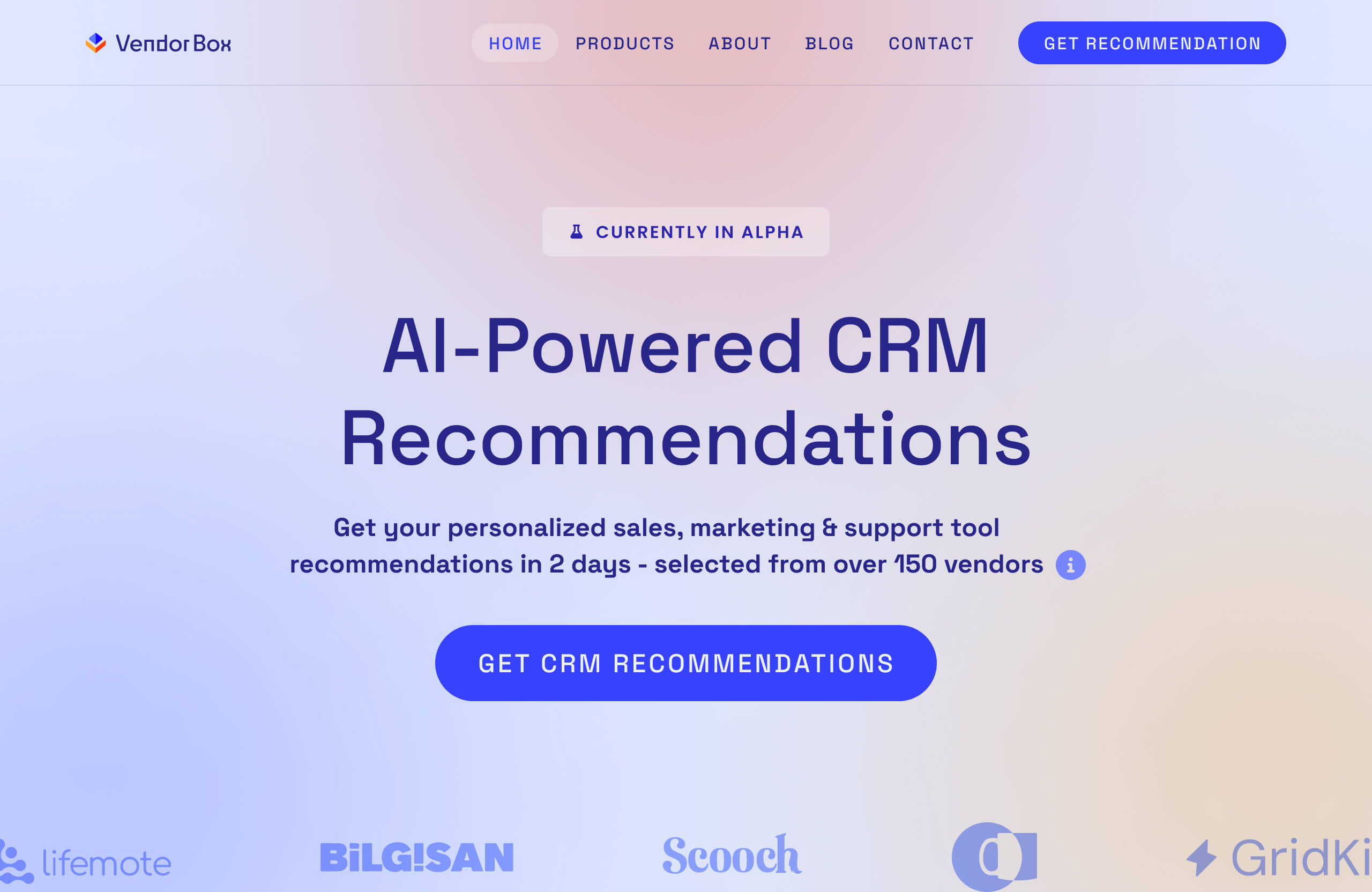
We are using more outcome-focused language, which extends to things like CTA's where it wasn't previously clear what the actions were.
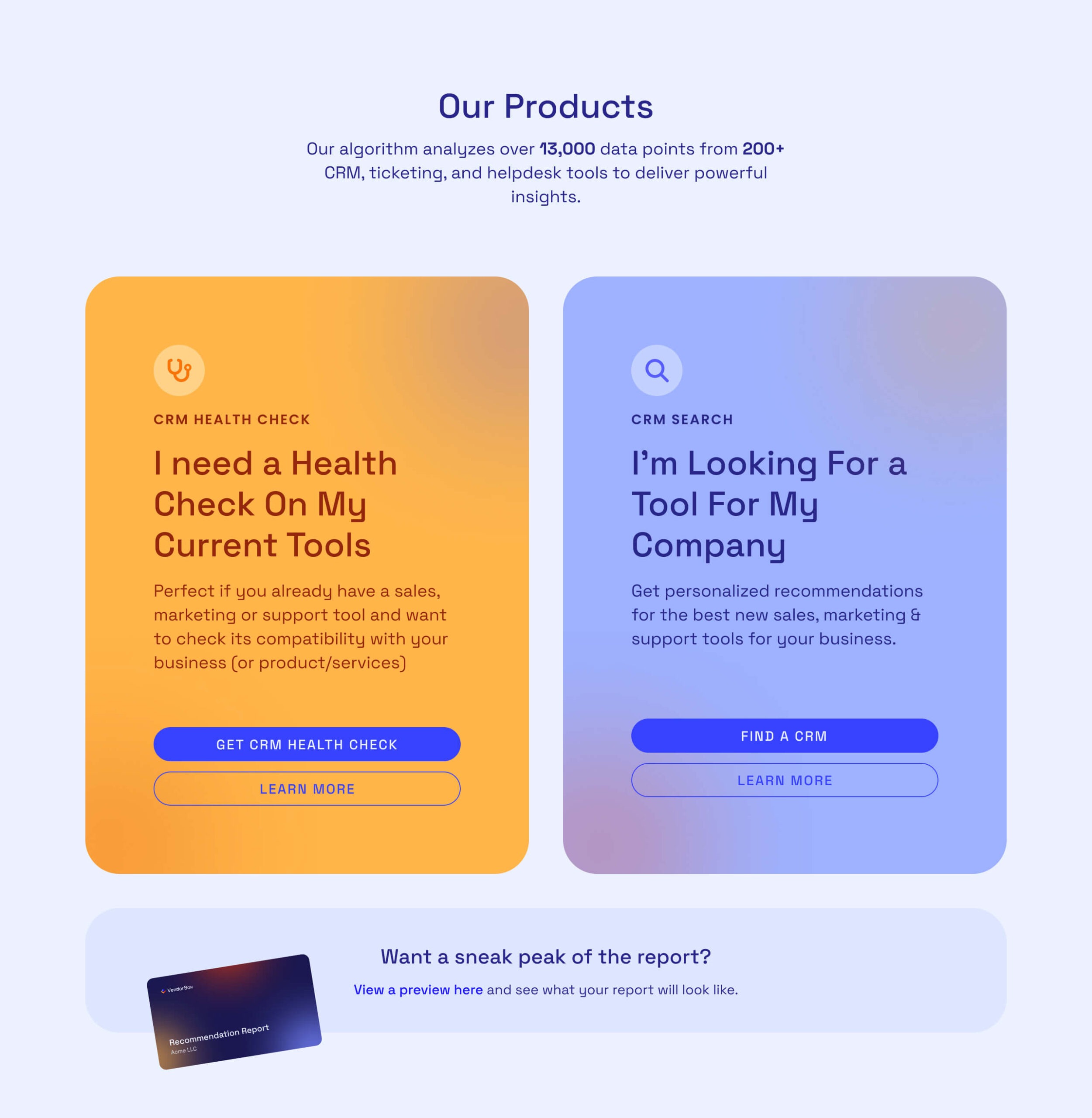
We clearly state that these are products, and give more information on the data we source.
Improve Trustworthiness & Credibility
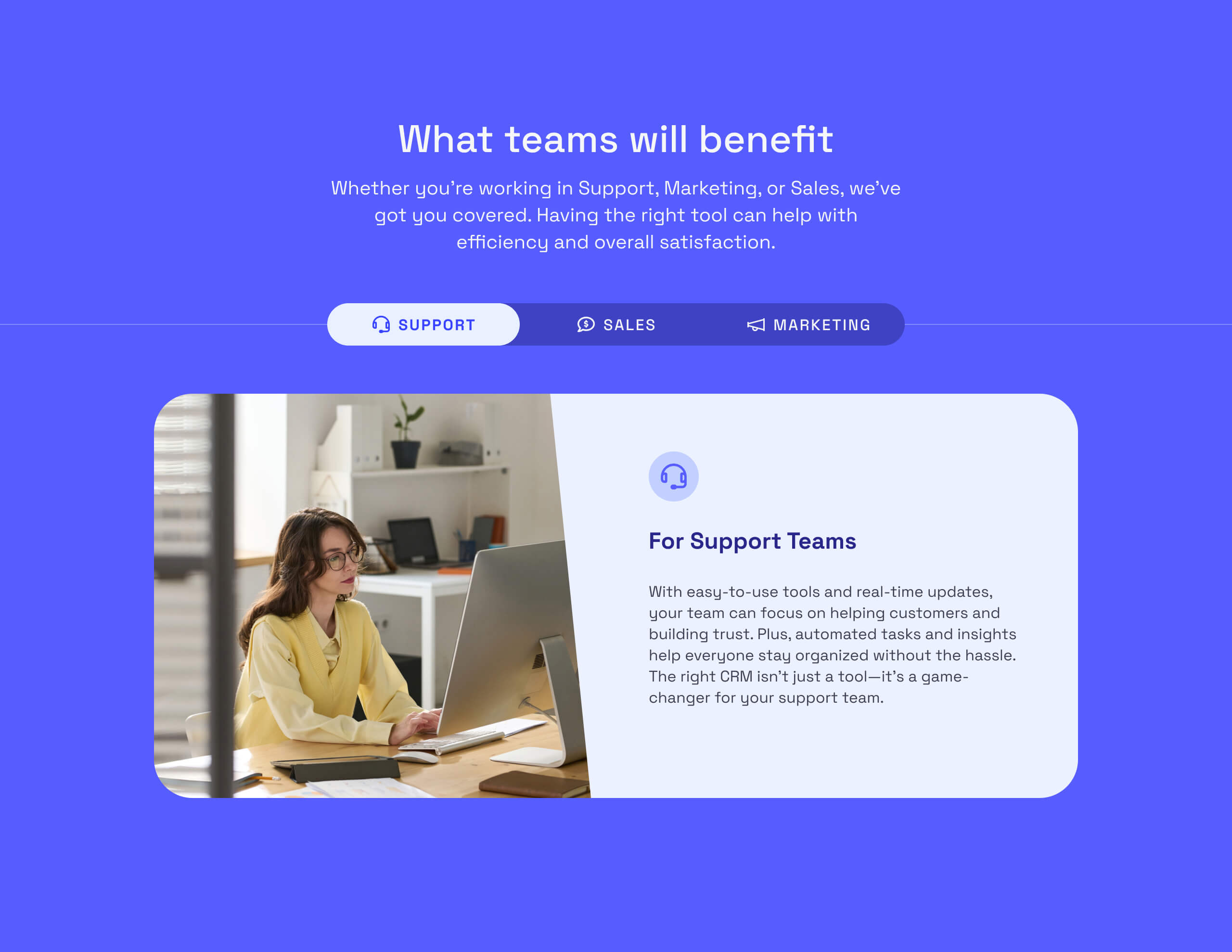
We state the types of teams that would benefit from a CRM and who we aim to help.
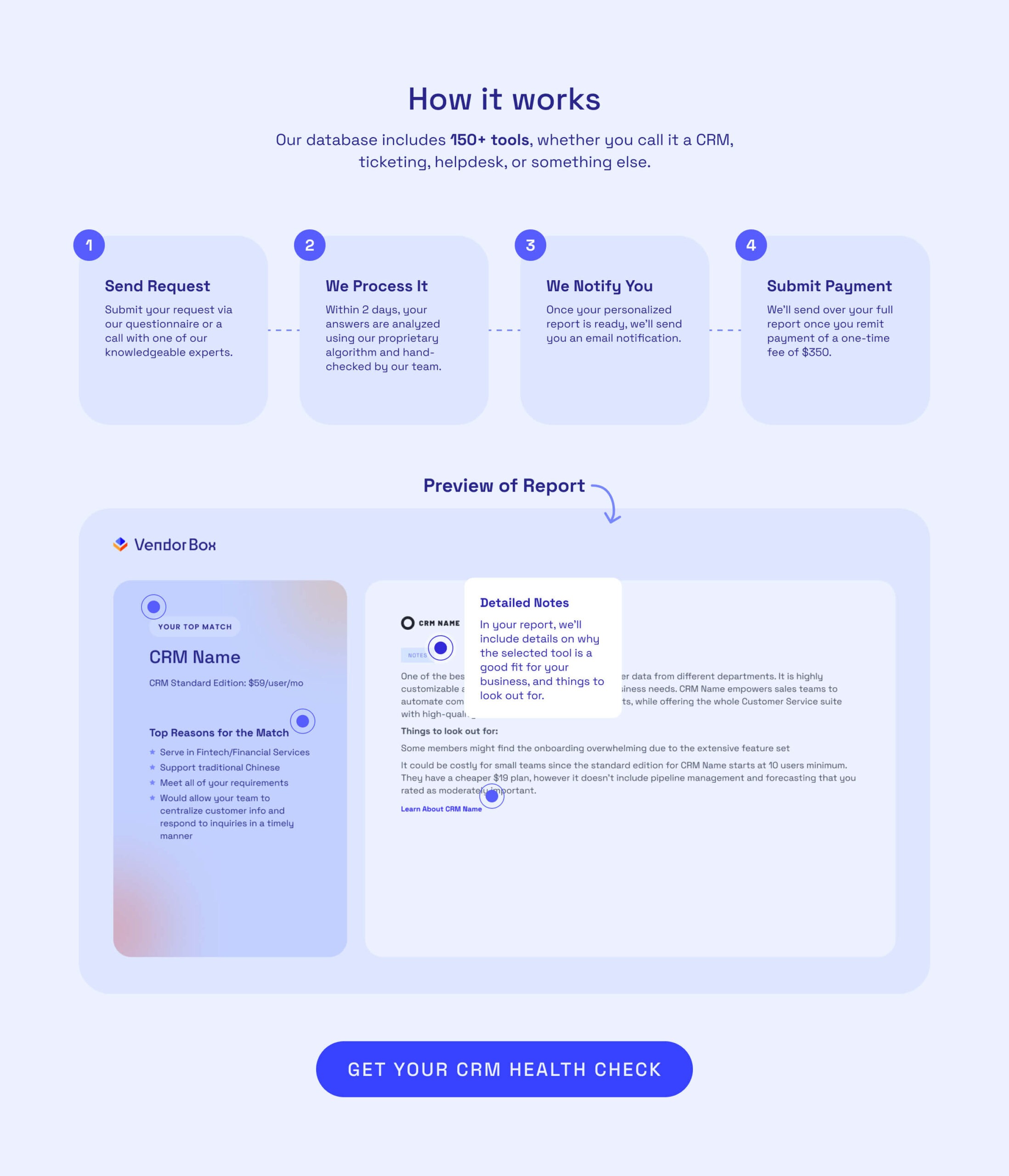
We show a preview of what the recommendation report you receive looks like.
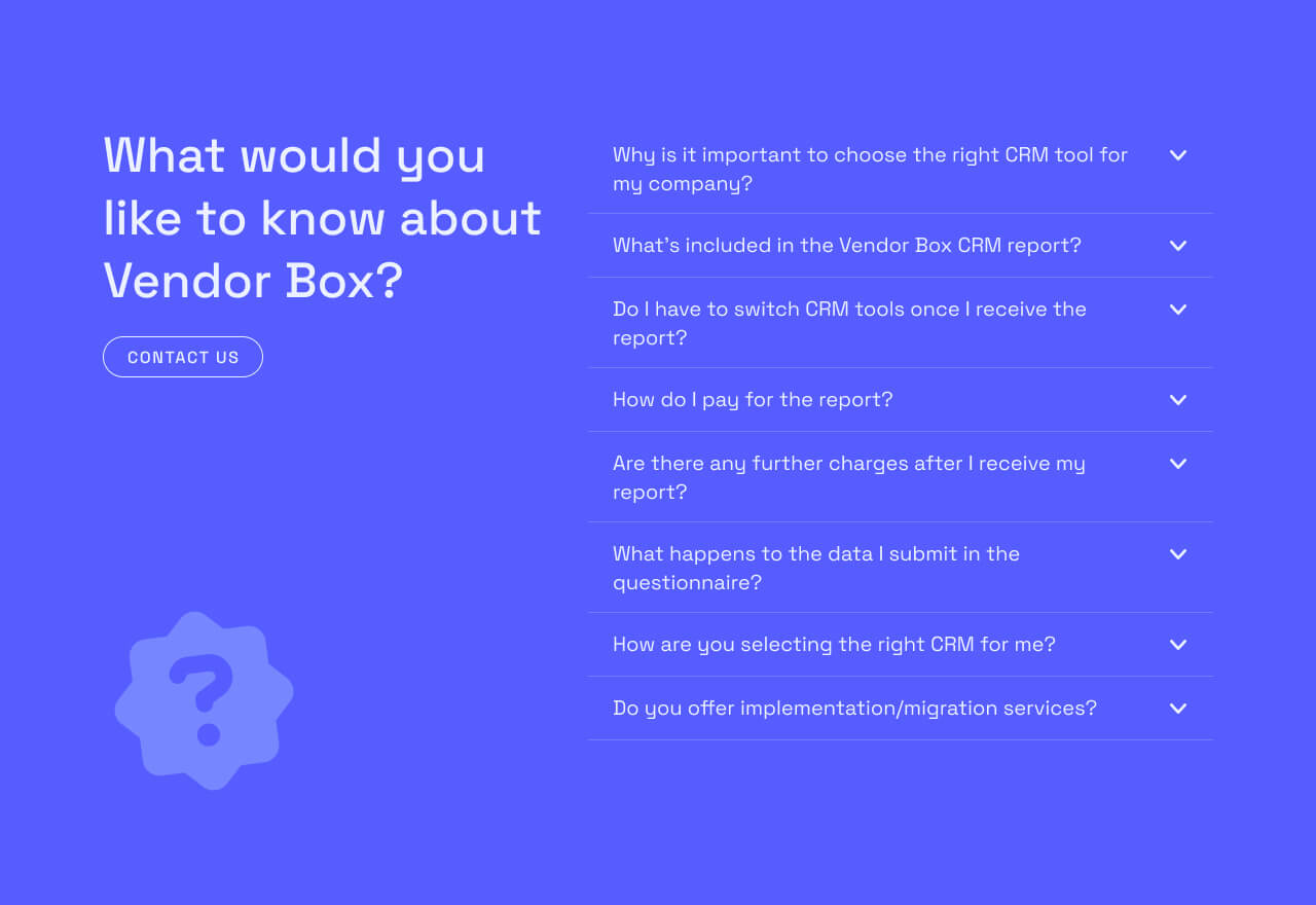
We have a section with information that addresses the most common questions.

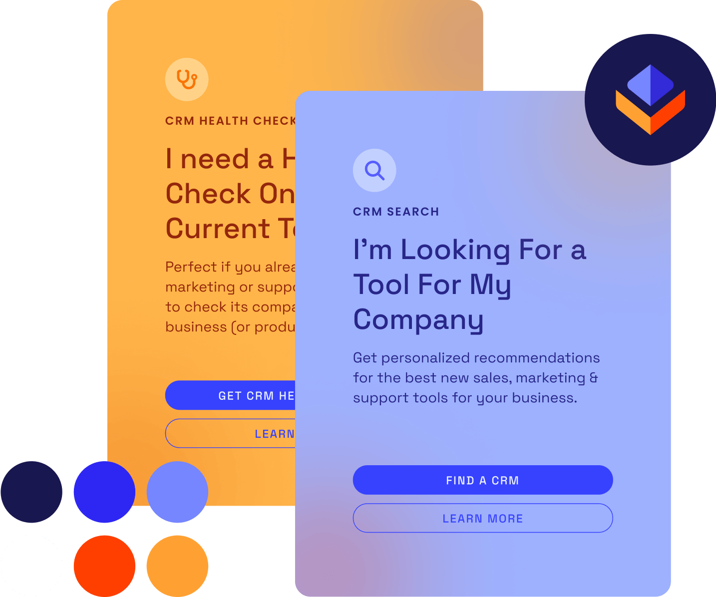
We updated the branding to reflect a more approachable, modern, and tech-centric visual style. This is done with the soft gradients, the rounded edges, and messaging.

An example of the branding implemented into one of our blog headers.
Impact & Next Steps
Speaking with customers directly was incredibly important in understanding how we were being perceived. Because this is a recently-released project, we’re still measuring the results.
Did user feedback post-update reflect an understanding of Vendor Box as a product?
Did more users complete the quizzes and explore service pages? Did this increase average session time on the website?
Did the newly-presented information and preview of the reports result in more inquiries or sign-ups?