Samdock
Samdock is a user-friendly CRM system that helps small and medium-sized businesses streamline their sales and marketing efforts by managing contacts, leads, and sales pipelines.
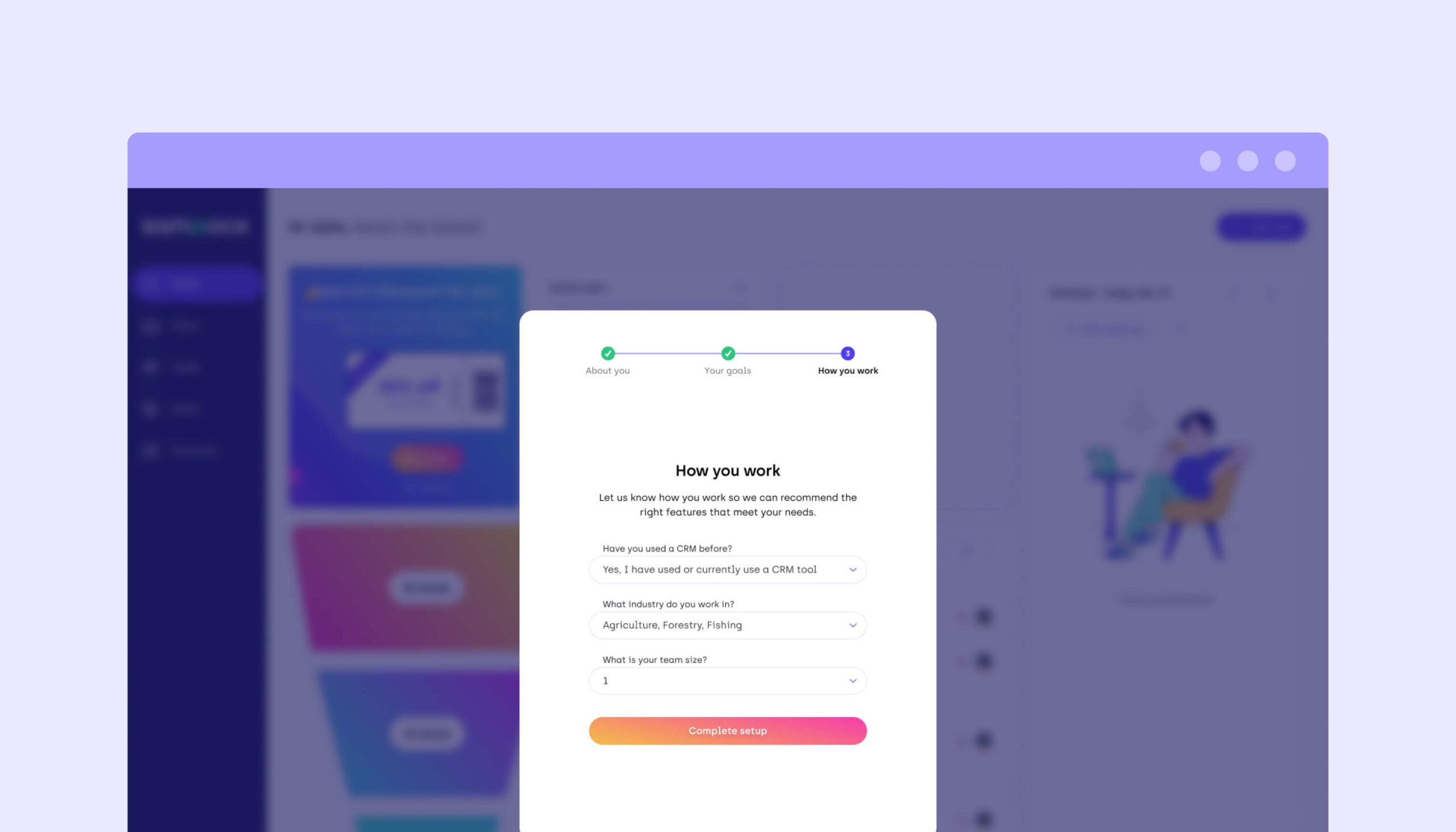
My Role
Stakeholders
CEO
Head of Product
Head of Marketing
Head of Customer Success
Front-End Engineers
Back-End Engineers
The Problem
Trial users were not converting
Samdock users that had to self-onboard were not finding the value of Samdock during their trial period. Because of our small team, our Customer Success team had limited availability to demo and onboard all users manually.
We had a very rudimentary onboarding process which was a simple walkthrough video that appeared when you entered the tool for the first time. To improve conversion and help users find their AHA! moment faster without the CS team, we needed to rethink the existing onboarding experience.
The Challenge
We needed data & insights
- We knew that CS-onboarded users converted better, but we needed to understand how the CS team onboarded users so we can emulate this in a self-service format.
- We did not have the time or resources to speak directly with users, so I needed to gather insights from other sources.
- We knew we had users with different needs, which meant that the value they got from Samdock relied on different features. However, we didn’t have the existing framework to collect data in order to customize the onboarding experience.
What is the current journey like?
Customer Experience is a shared responsibility. Each team from Marketing to Support own a piece of this puzzle. Onboarding is a crucial series of touchpoints, and we needed to make sure that all stakeholders shared their expertise in this process. What did I ask them and why?
Customer Success
Why Customer Success is important in this process
What information I needed from them
- What is your cadence for following up with users?
- What are our users looking for? What are their pains & challenges? How do we solve those for them?
What info do they need from users to properly onboard?
- What type of user am I speaking to?
- Where do I best contact them?
- Are they experienced with CRMs?
- Are they a “One-man-show” or are they a team?
- Why are they looking for a CRM?
Marketing
Why Marketing is important in this process
What information I needed from them
- What do the touchpoints we have with them look like?
- How often are we contacting them?
- How do you segment?
What info do they need from users to properly onboard?
- Name
- Industry
- Experience level with CRMs
- Basically, the more I know about them, the more I can customize the content that we send
Product
Why Product is important in this process
What information I needed from them
- Who are our users?
- What core features are crucial to mention in the onboarding?
What info do they need from users to properly onboard?
- Why are they looking for a CRM?
- Are they experienced with CRMs?
- Are they a “One-man-show” or are they a team?
Mapped out, this was what the current experience looked like:
What we extracted from this:
What did we extract from auditing the status quo?
First and foremost, with insights from all teams, we were able to paint a clearer picture of our users and what they are trying to solve. This was helpful because it informs us why users come to Samdock, and was the first step to understanding what features drive the most value to each user type. Here’s a summary:
Now that we know what value users are after, we brainstormed what questions we should ask in order to appropriately cater to their exact needs. However:
- We cannot overwhelm users with too many questions
- We needed to ask the right questions to customize the onboarding
Here’s what we landed on in terms of questions:
Why these questions?
These would help us figure out the following customizations:
- The type of features we show
- The order in which we present them
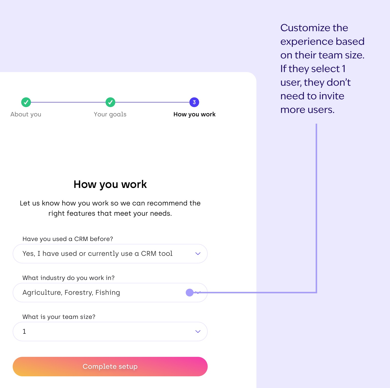
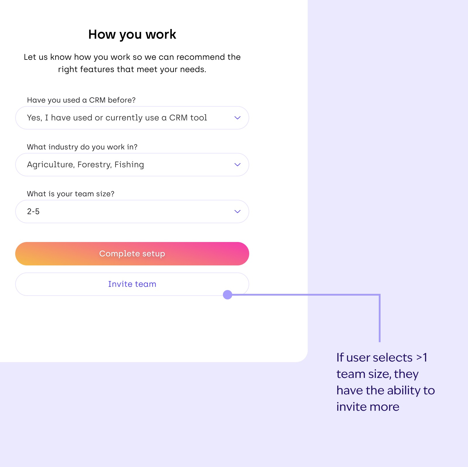
- Whether team-related features were relevant
- Whether they required a dedicated CS representative
Getting inspiration from other onboardings
We understood what we were not doing well in onboarding, but how are others doing it? I looked at a few different tools to see how they handled their onboarding flows. This included some CRMs and a few adjacent tools such as:
Here’s what I learned after going through their onboarding flows:
Walking in the user’s shoes
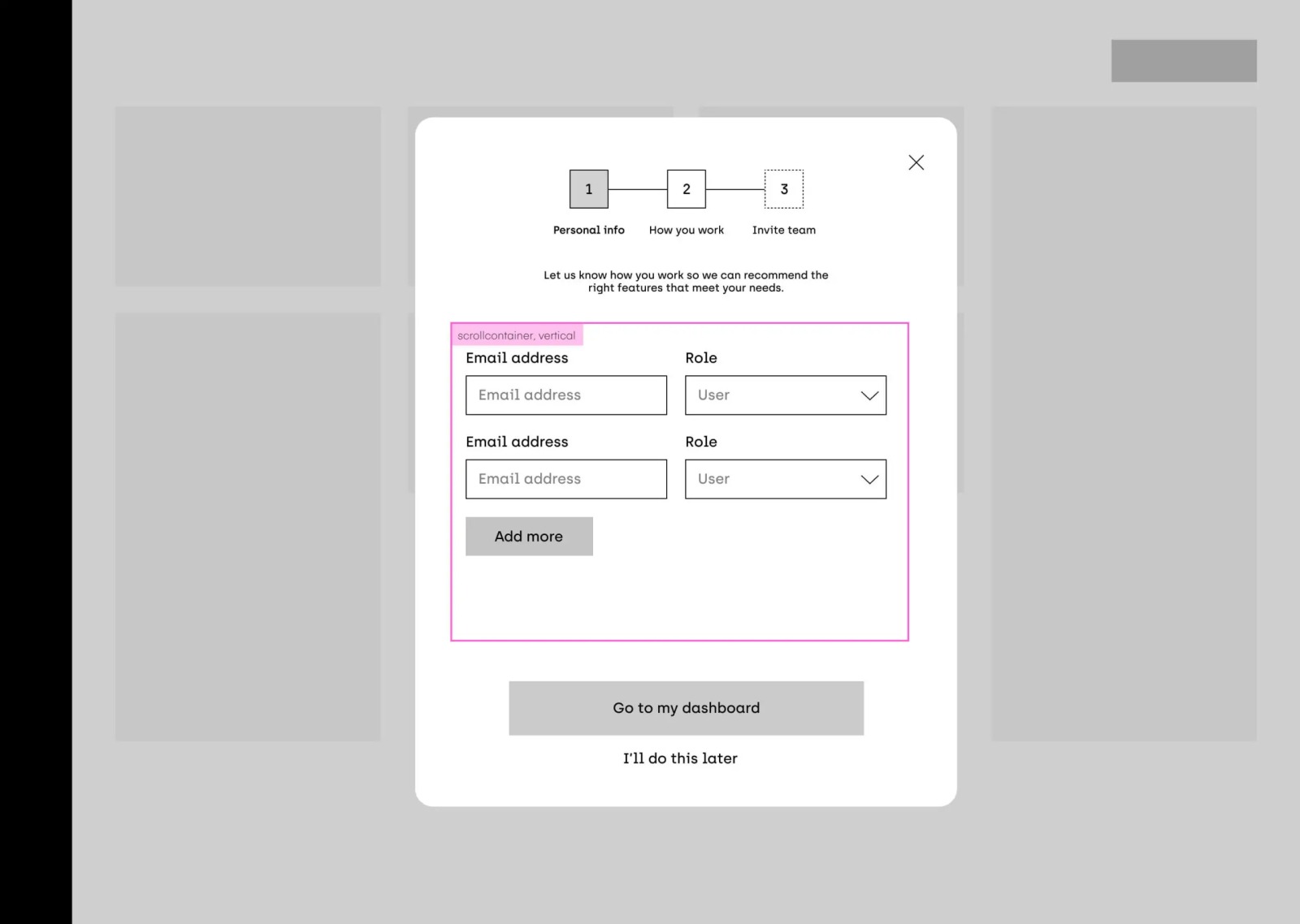
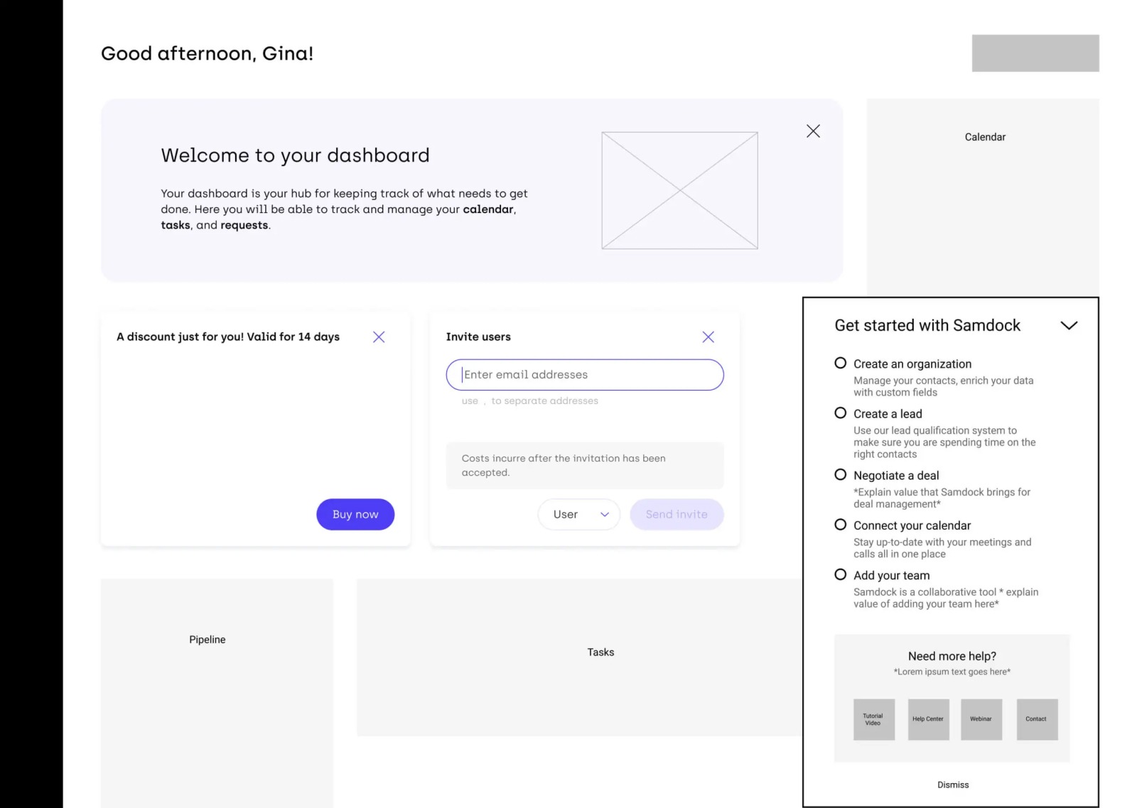
Now it was time to illustrate what the user flow would look like with the proposed changes. There were a few things that all stakeholders needed to keep in mind during this process:
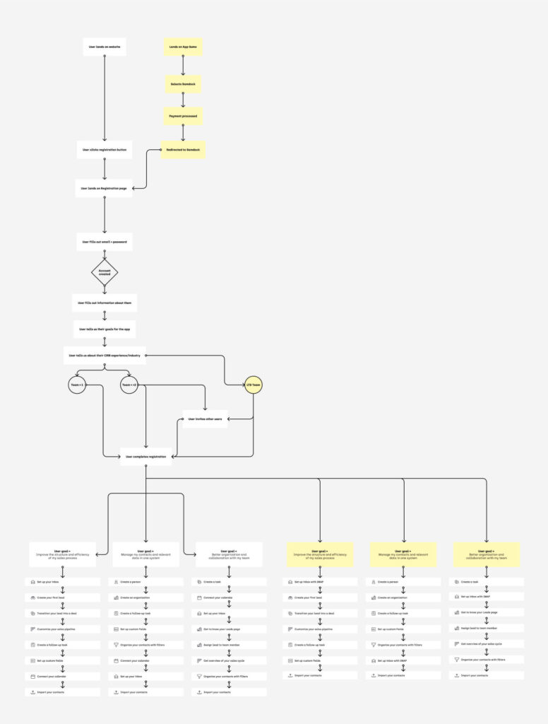
Experimenting with ideas
Our foundation with the flow was already established. Now we needed to figure out what was needed from a design perspective:
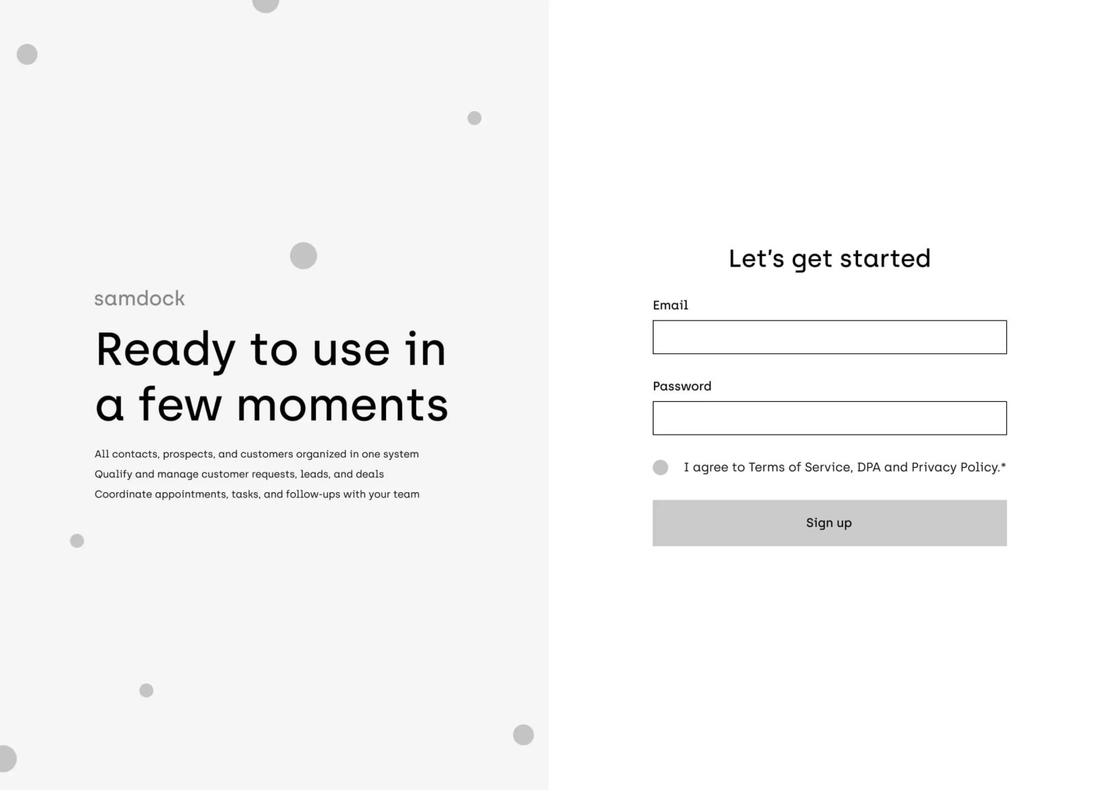
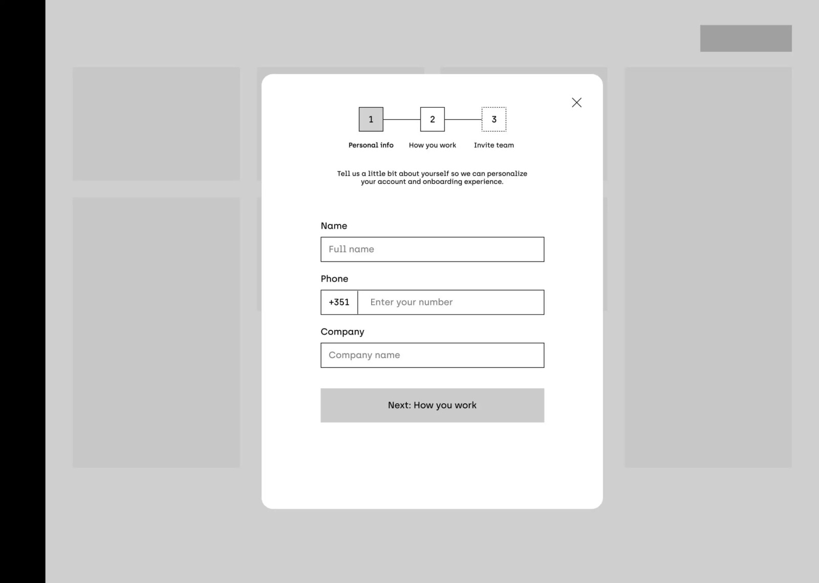

The solutions
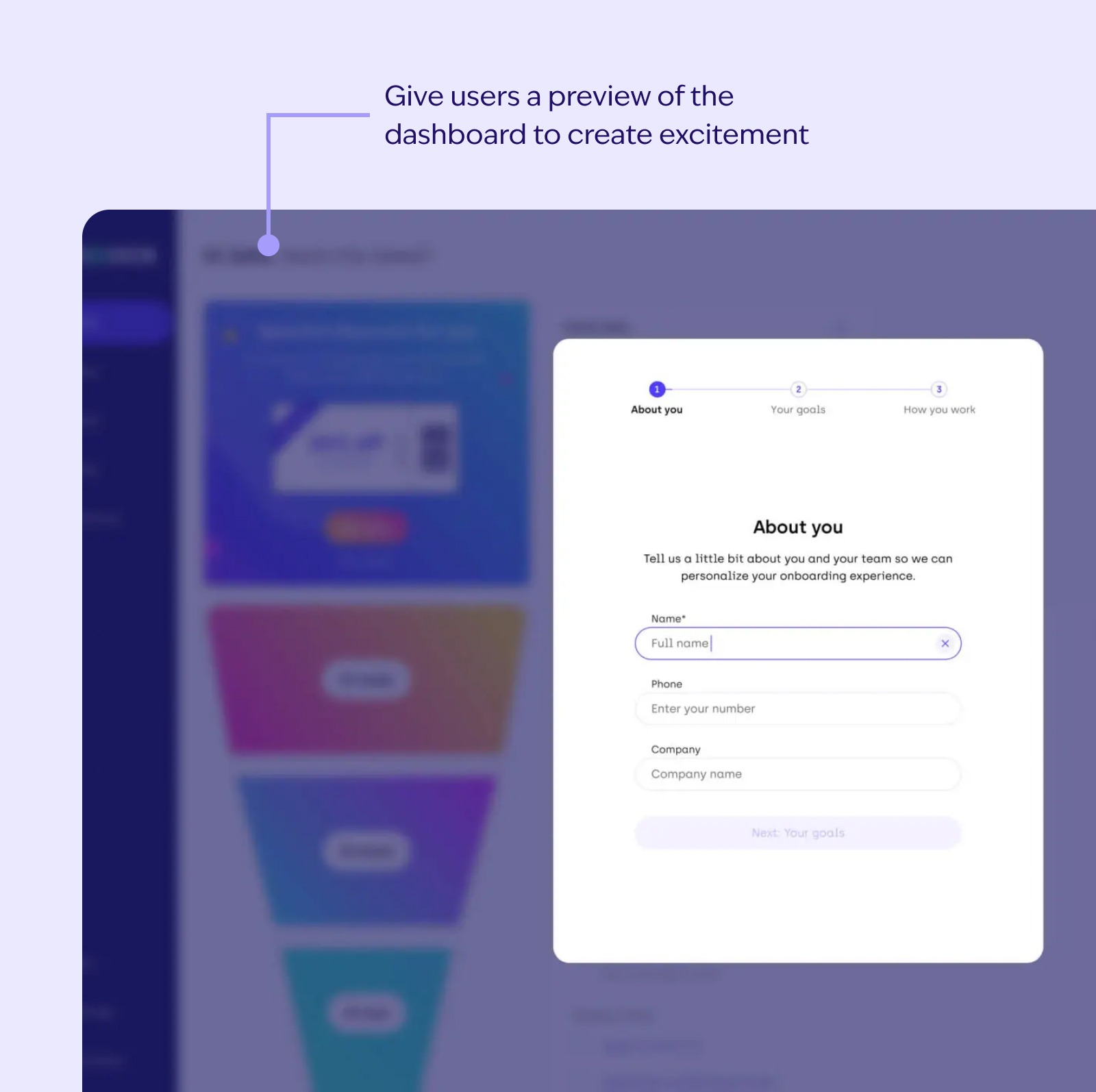
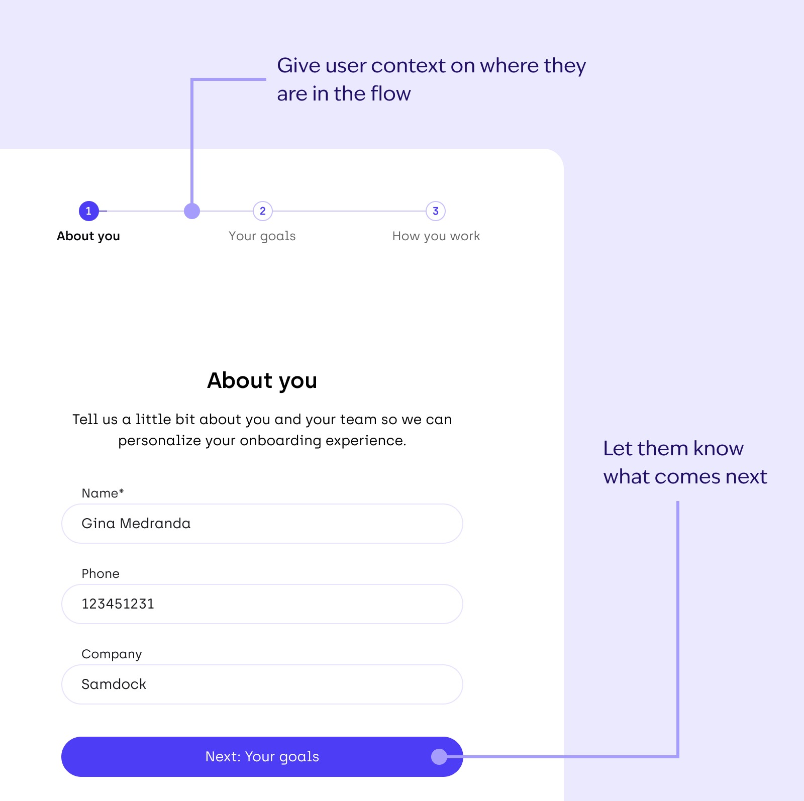
Throughout every step, we gathered feedback from Marketing, Customer Success, Developers, and Product. This made sure that the solutions we designed were feasible and practical. But, I’m a firm believer that practicality is 90% of the solution, and the other 10% should be delight.
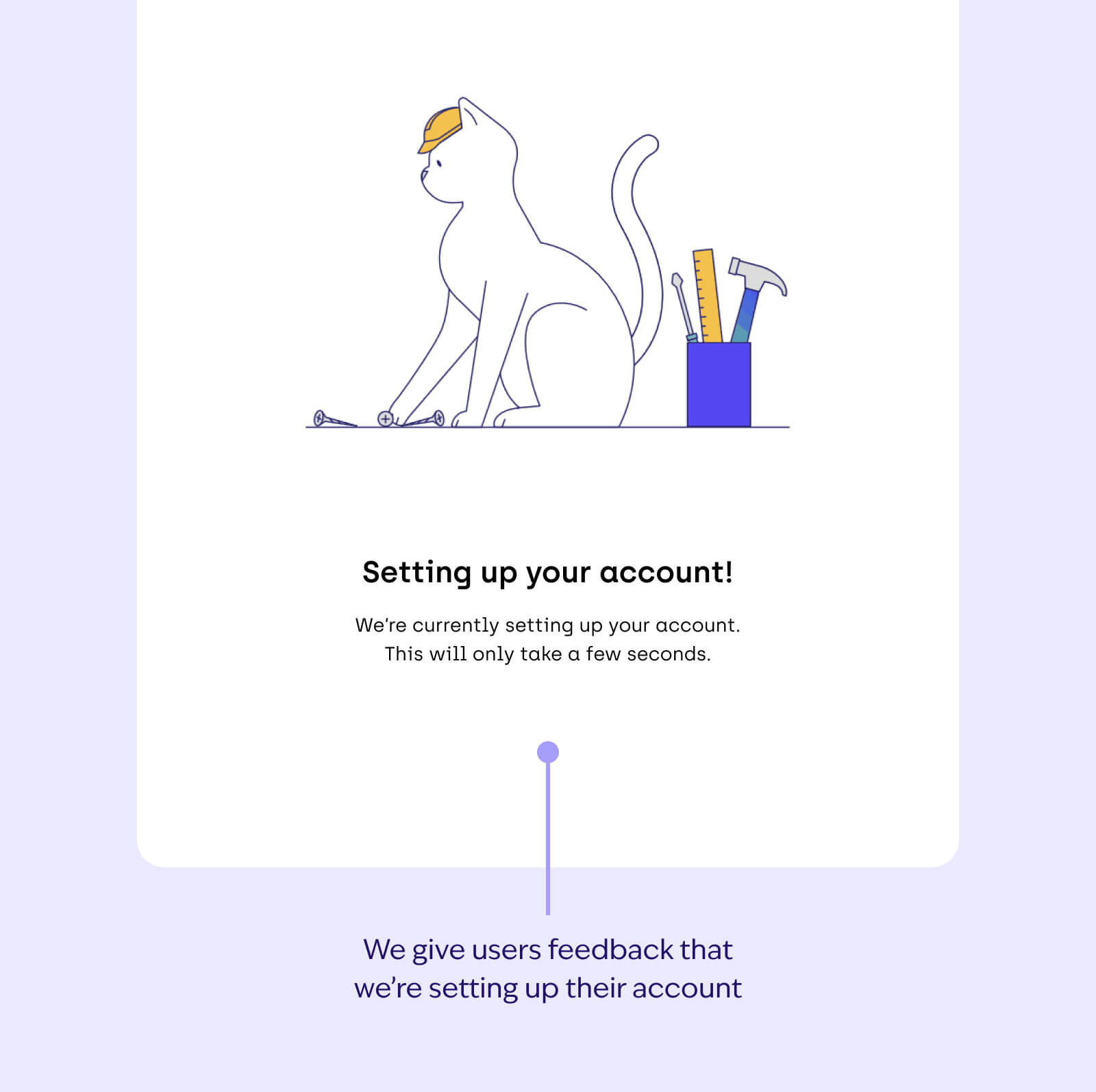
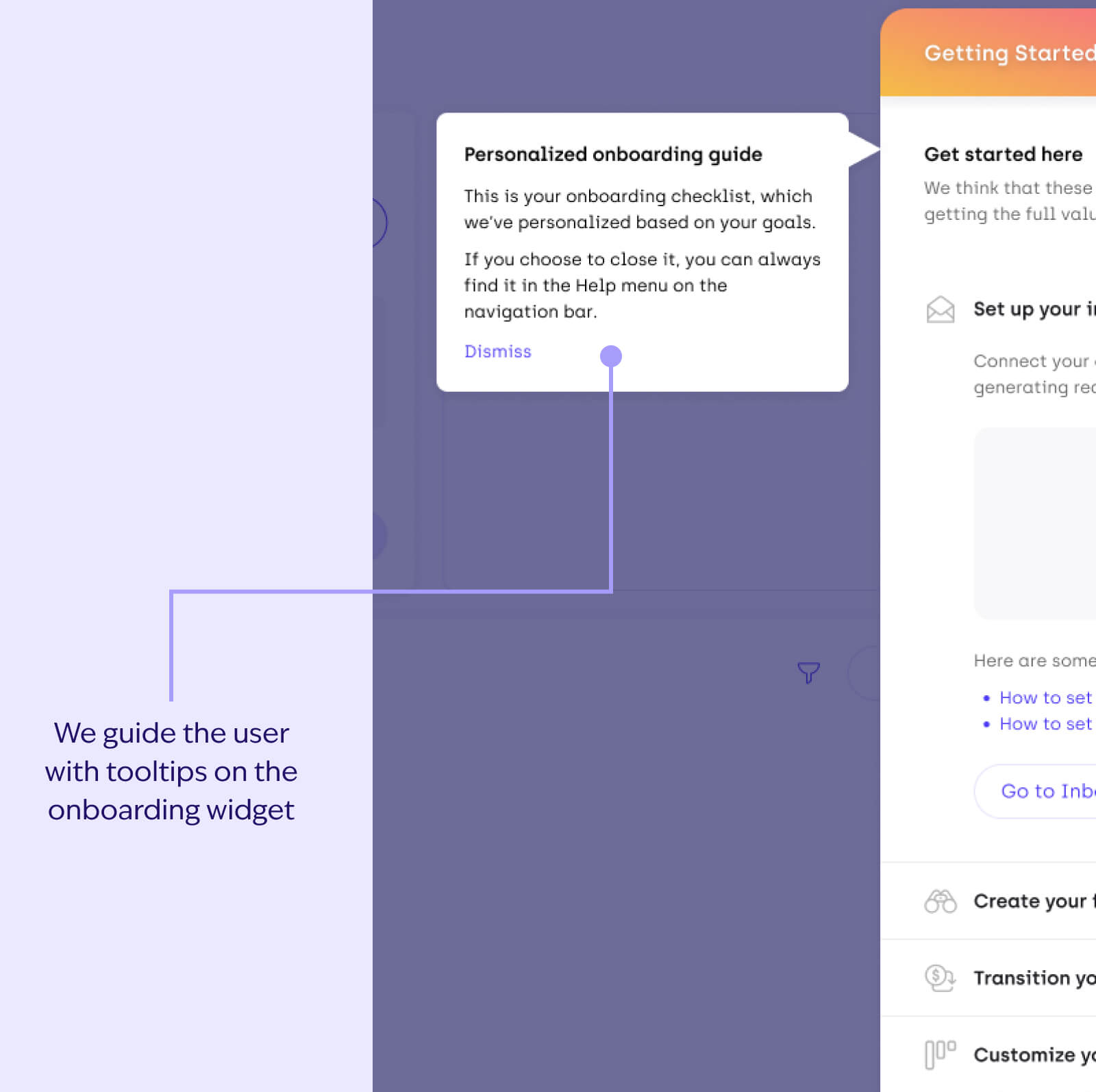
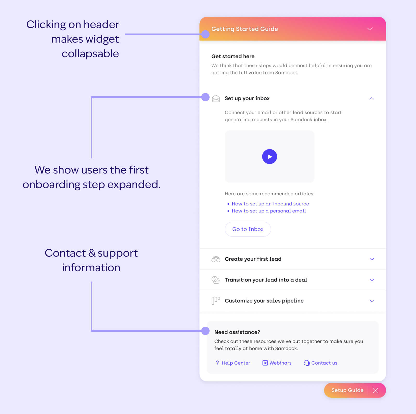
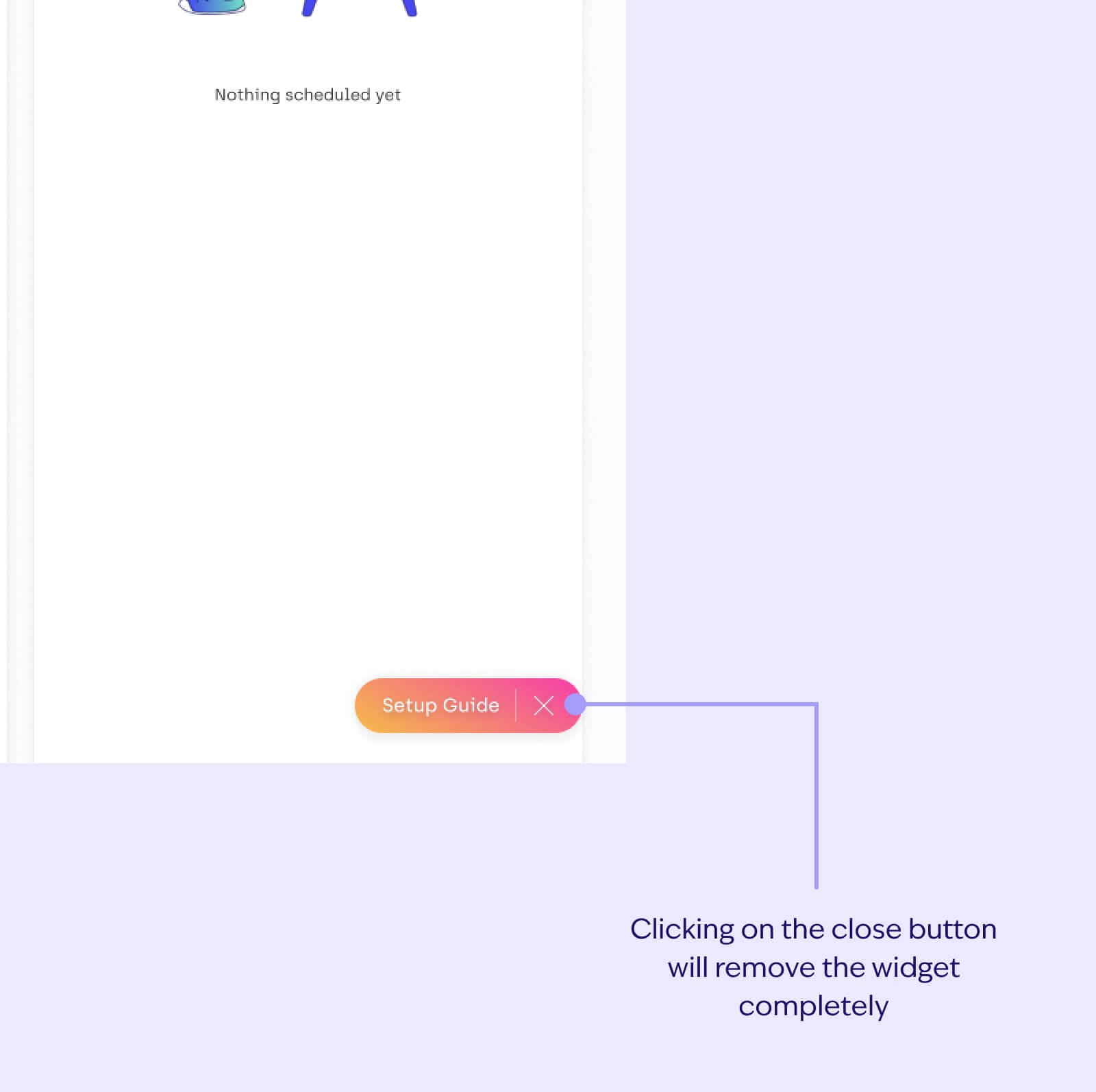
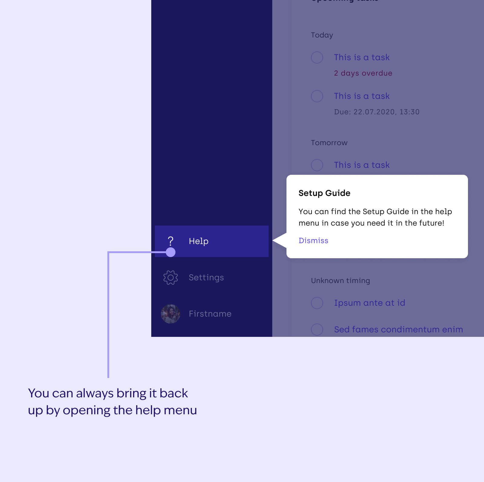
We decided to inject as much personality as we could into this experience. Here’s what the experience looks like.
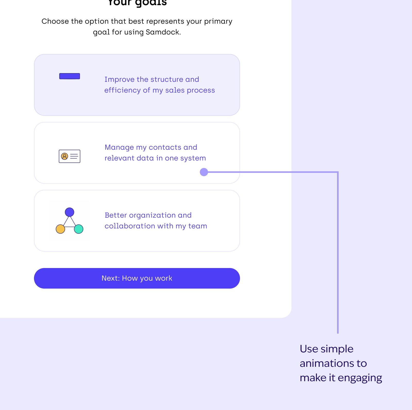
Preview of animations:

Measuring the impact
Although I left Samdock before the feature was released, as a team, we were satisfied with the data-driven solution we established. Why we considered the design process successful:
- The design strategy was based on extensive collaboration between Customer Success, marketing, and Product, which ensured that the new onboarding flow addressed key user pain points identified in early-stage research.
- Iterative designing and feedback sessions were key in refining the onboarding flow. Early iterations were discussed in calls with developers and stakeholders, insured that the solution was technically feasible and aligned with business goals.
- The discovery and design work completed during this process set a user-centered foundation for subsequent teams to build upon.
Next steps
In early discussions, we had already wanted to establish metrics that we’d look at in order to determine success, these included:
What % of users are using the features recommended in the onboarding steps? This will help us understand the direct impact of guiding users towards the value of the product.