Deskbird
Deskbird is a workspace management software that helps companies manage hybrid work environments by making it easy to book desks and meeting rooms.
My Role
Stakeholders
Product Manager
Tech Lead
Web Developers
Mobile Developers
UX Writer
The Problem
Upholding privacy regulations
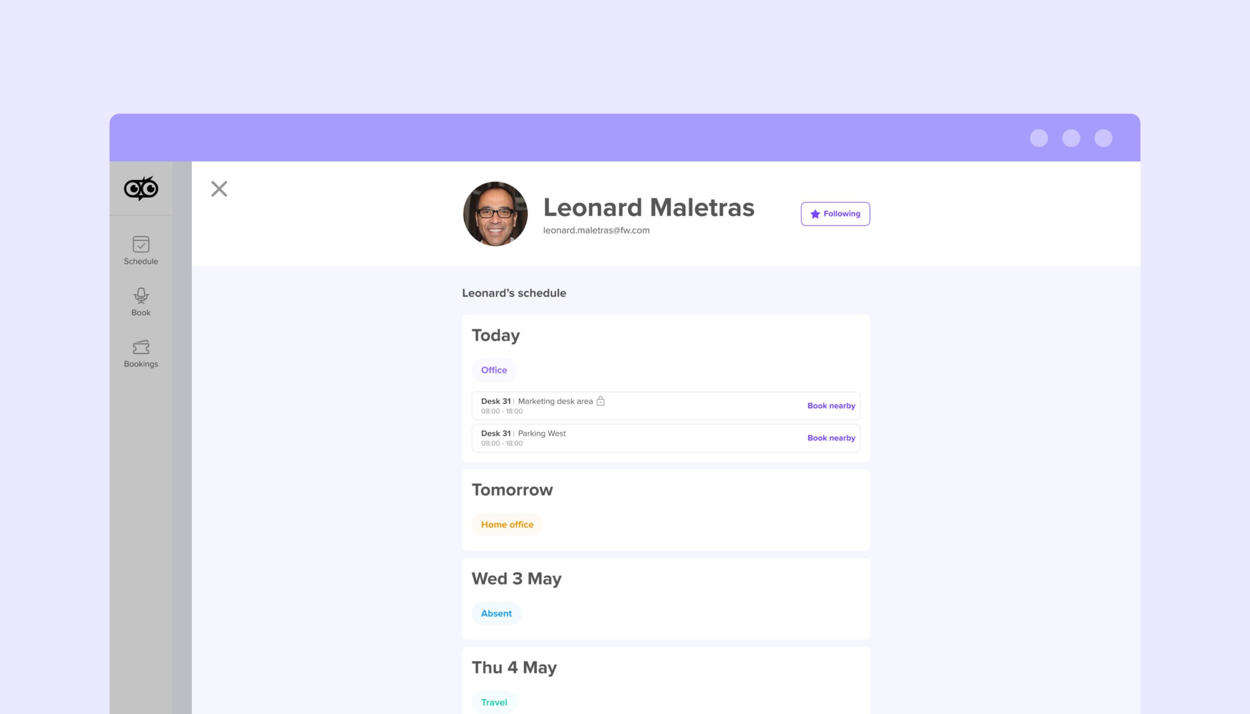
We had recently released a new feature called Colleague Profiles. However, in Germany for Enterprise customers, certain employee info found on those profiles is considered sensitive.
In order to allow those Enterprise customers to remain compliant with local regulations, we needed to introduce the ability for employees to control who can view their profile and schedule.
The Challenge
Time & technical restraints
- We needed to release this on a very tight turn-around.
- We needed to work with what we had in the existing product (i.e. working around lack of a notifications center)
- We needed to untangle our different privacy layers and ensure it’s clear
Defining plan of attack
Our CPO and Product Manager spoke directly with German enterprise customers to get a better picture of why they needed this, and how it should work.
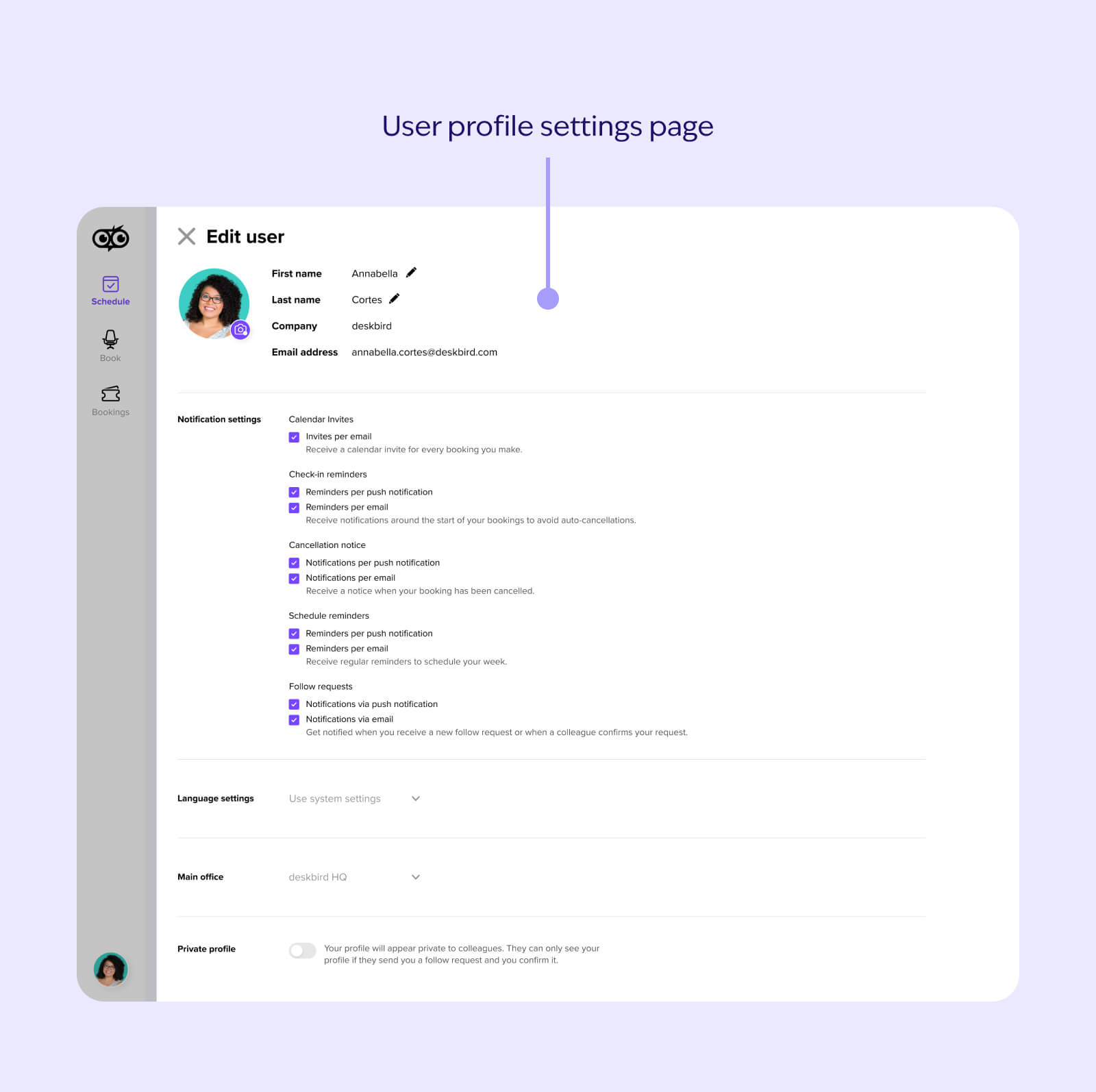
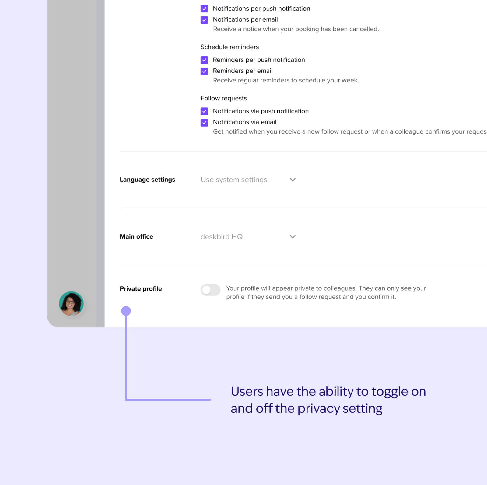
Let users control their privacy settings
Let users control their privacy settings
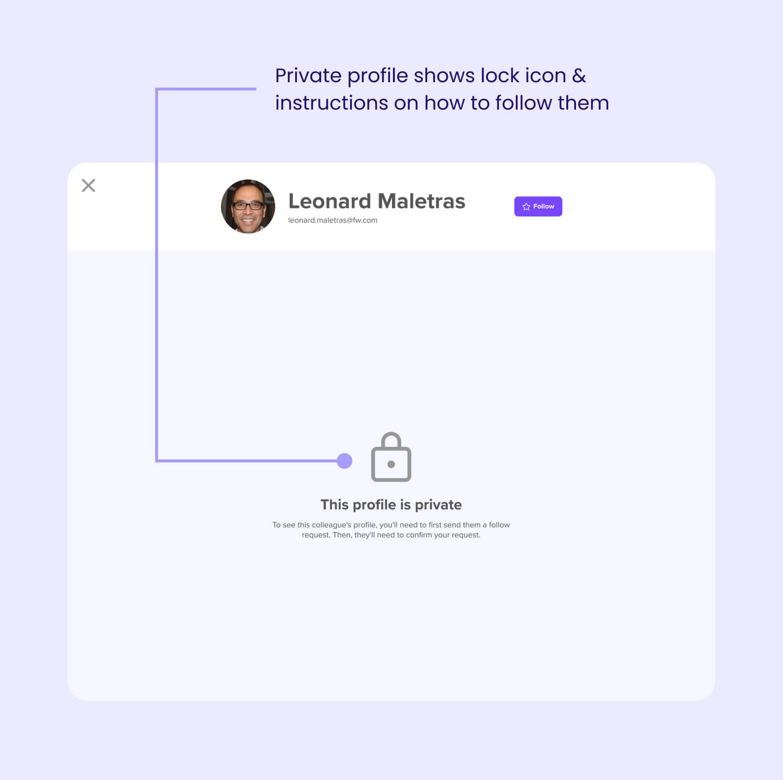
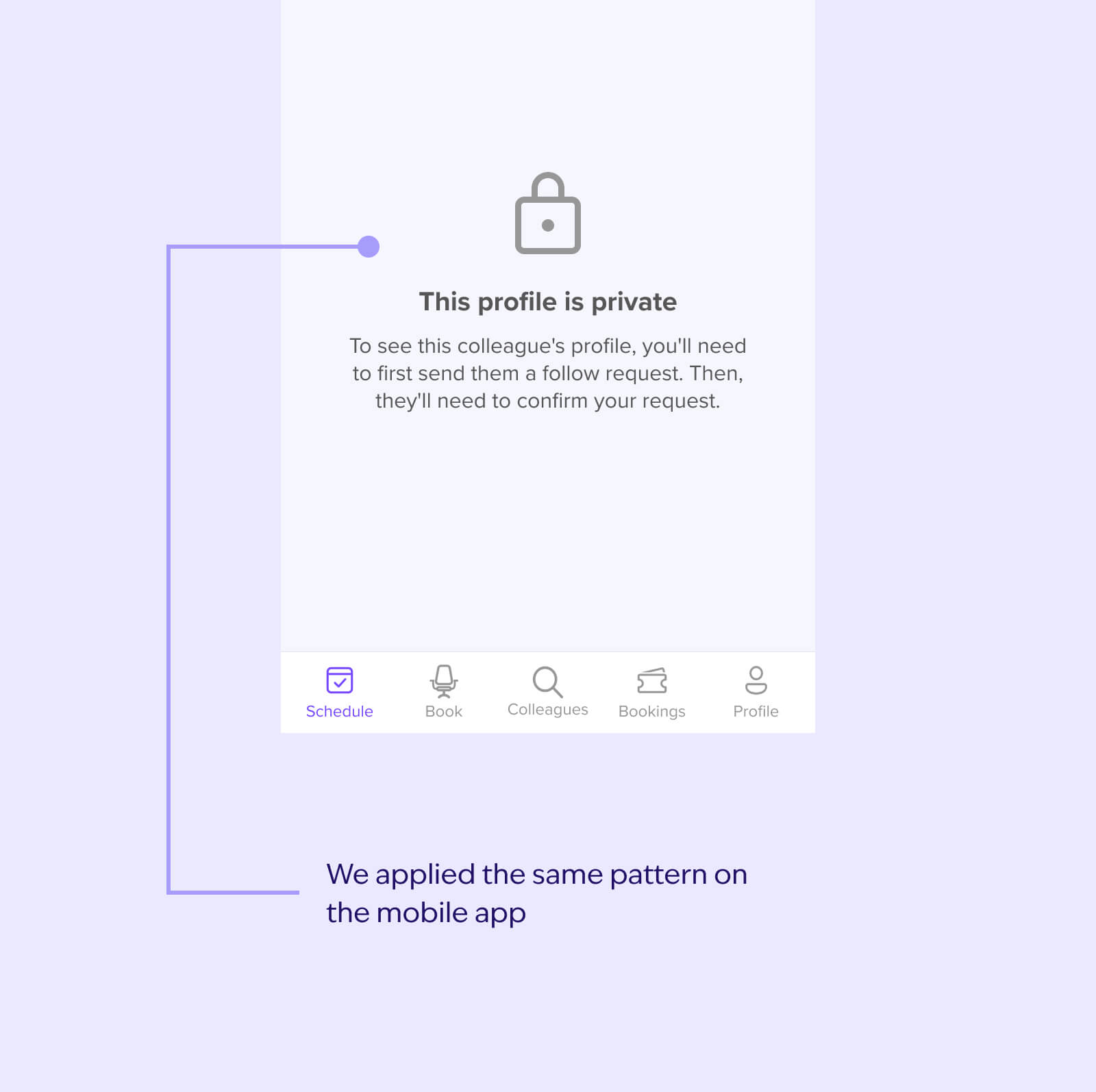
Request permission to view a user’s private profile
Inform user about permission request
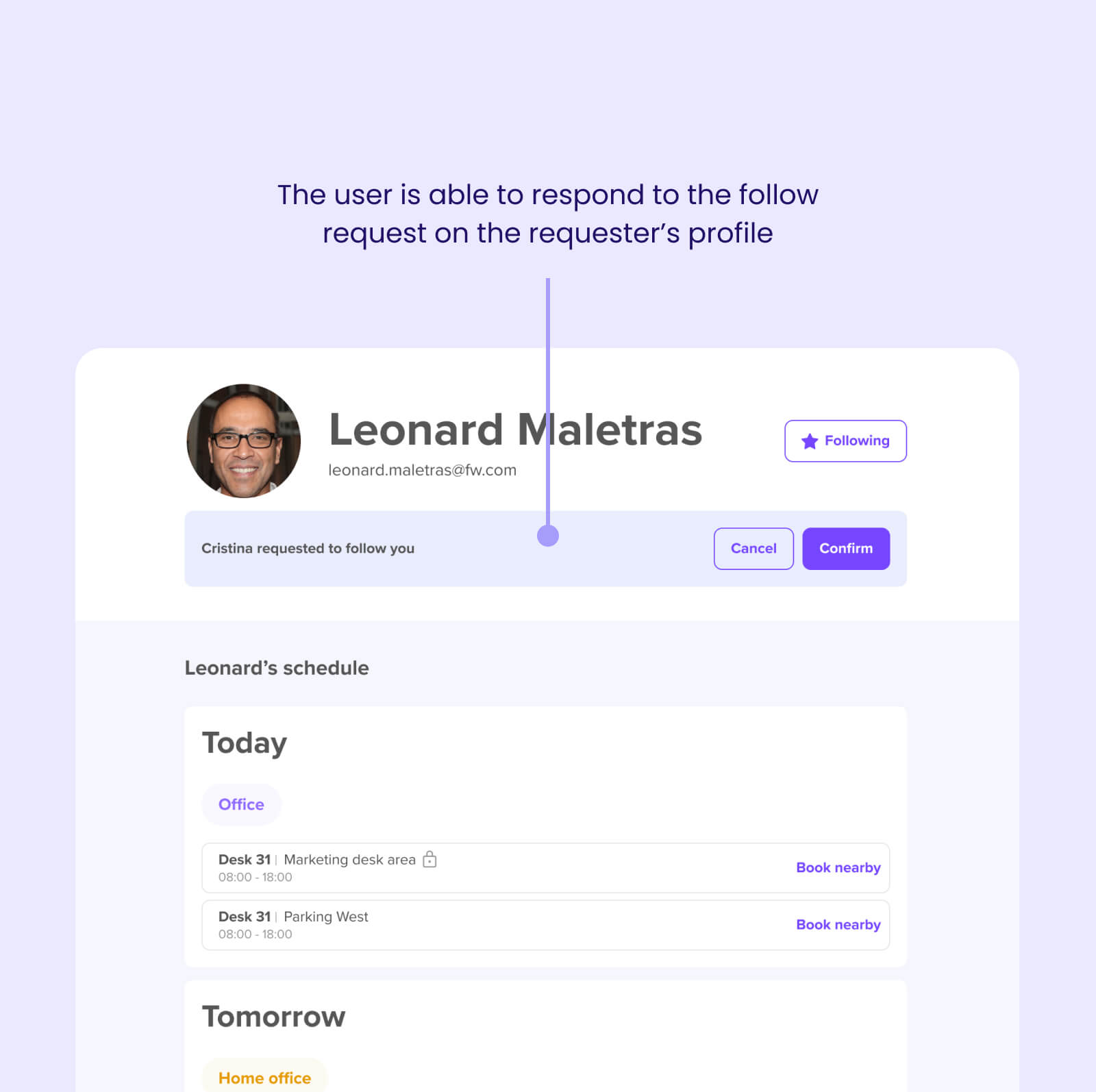
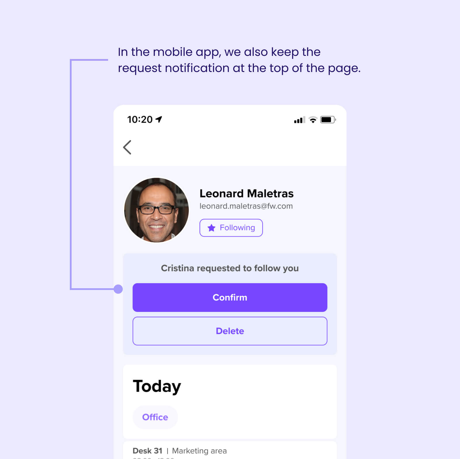
Let user respond to & manage permission requests
Understanding our current architecture
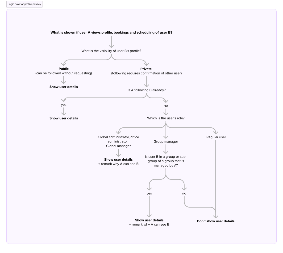
Our first step was to understand how this new privacy level would work on our existing architecture. We had 3 layers of privacy that played different roles and hid/showed different pieces.
We synced up a few times to make sure we figured how each privacy/visibility level interacted with the other. Ultimately, we drew out this flow that helped us understand the implications of introducing a new privacy layer.
Making the follow experience intuitive
We wanted this feature to feel intuitive, and one way of ensuring this was research. I decided to look at existing following paradigms in social applications and gather inspiration from there.
I looked primarily at 2 very well-known applications and tested out different flows (i.e. following, removing a follow, rejecting a request, etc.):
So we heavily based our functionality on Instagram’s following paradigm.
Defining user interactions
With all the information collected, I felt we had enough to start defining the user flows. This step was crucial so I could communicate the interactions with all teams (UX, Product, and Development). This helped showcase what the user journey would look like going through this feature, and to help catch edge-cases.
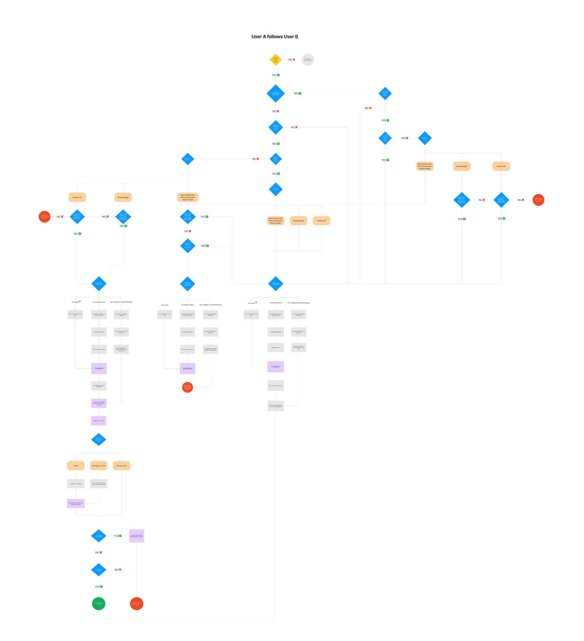
Here's what we wanted to communicate with this:
Wireframing
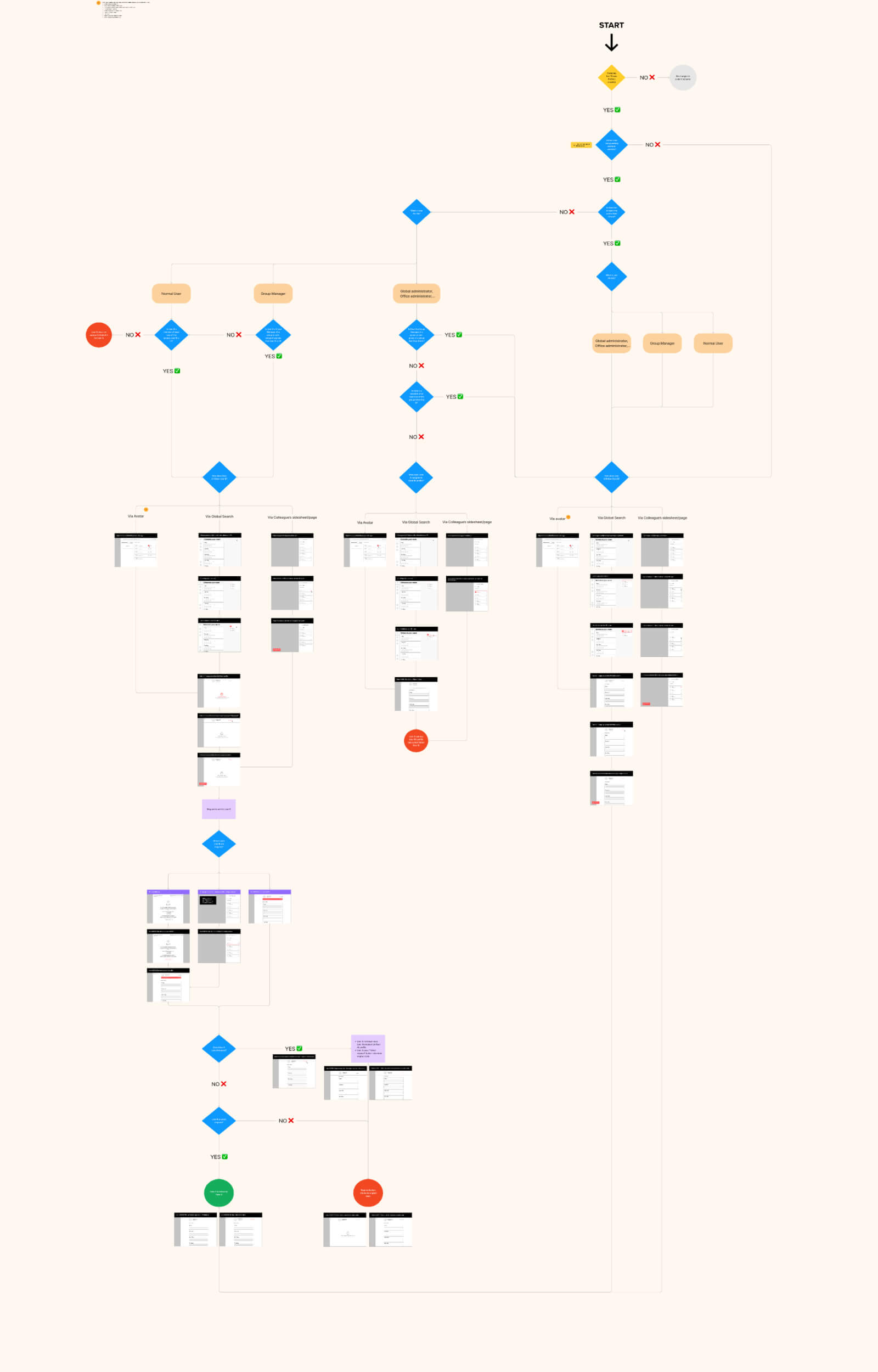
For this project, I decided to incorporate the wireframes directly into the user flows. There were 3 main reasons for this.
Getting feedback
Clarity
Source of truth
The solutions
Now it was time for hi-fidelity. Here is where our design system came in handy. There were already a lot of pre-existing components that were used, which saved us time.
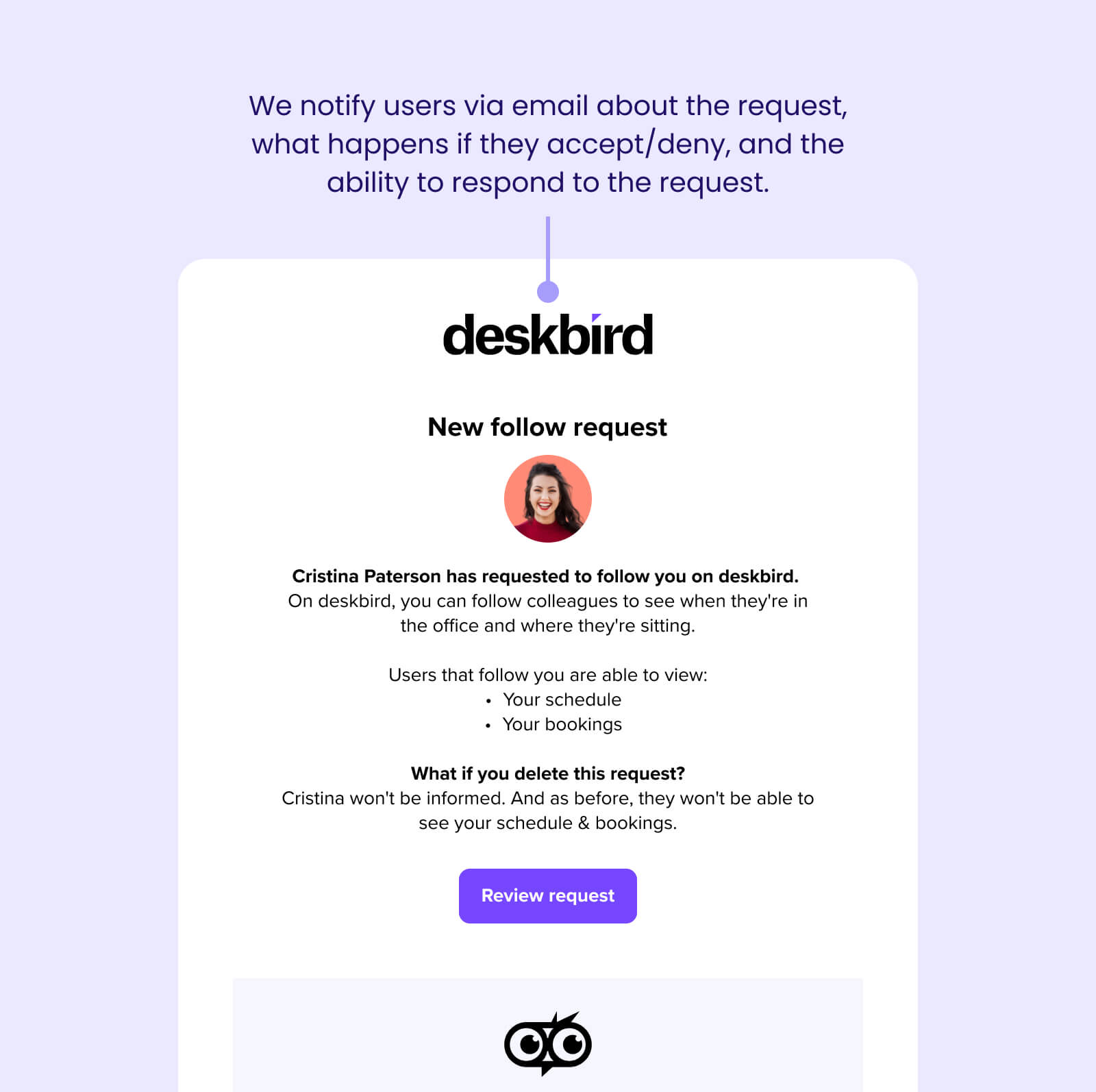
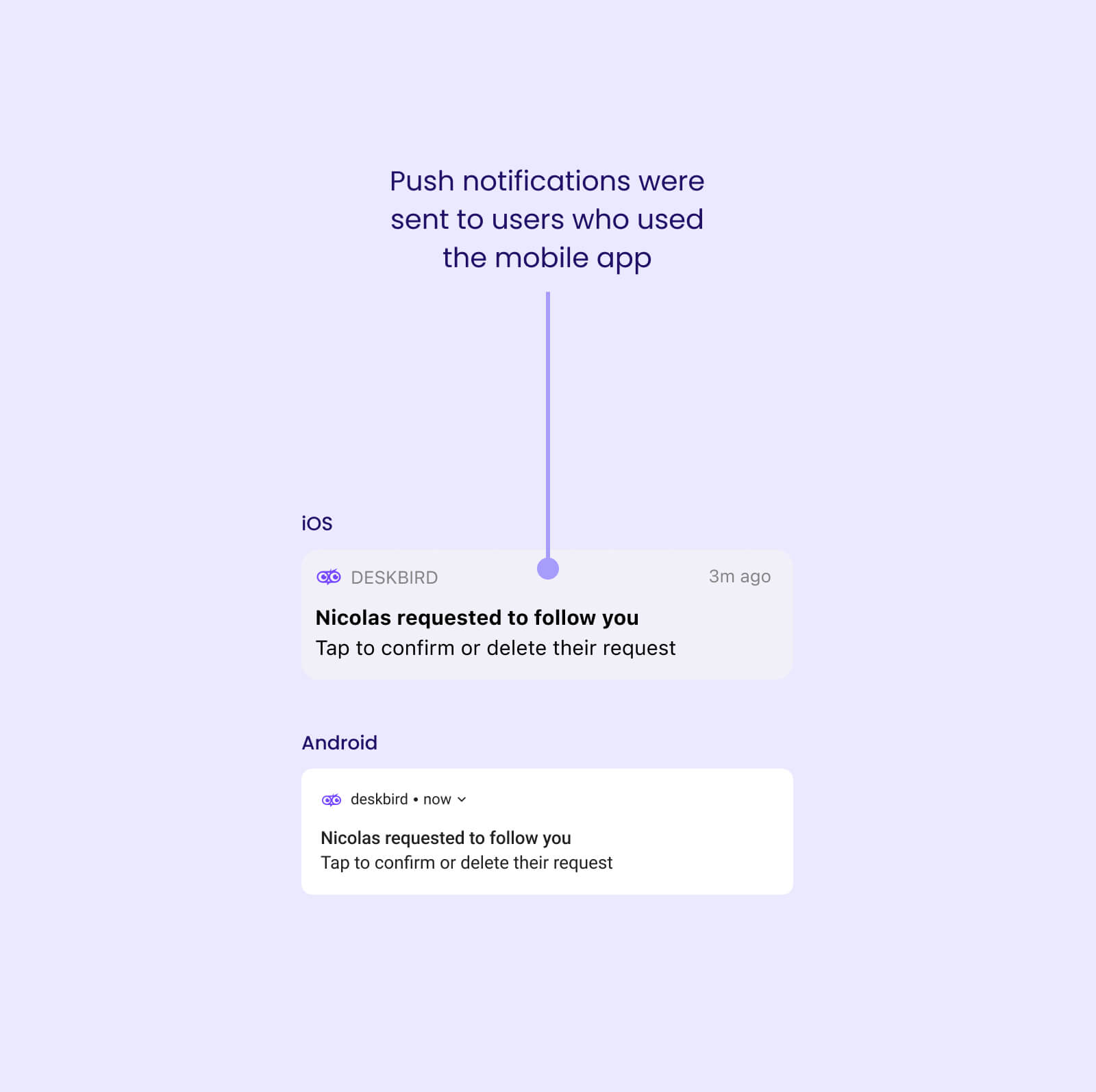
Inform user that they received a follow request
Where would users expect to be notified?
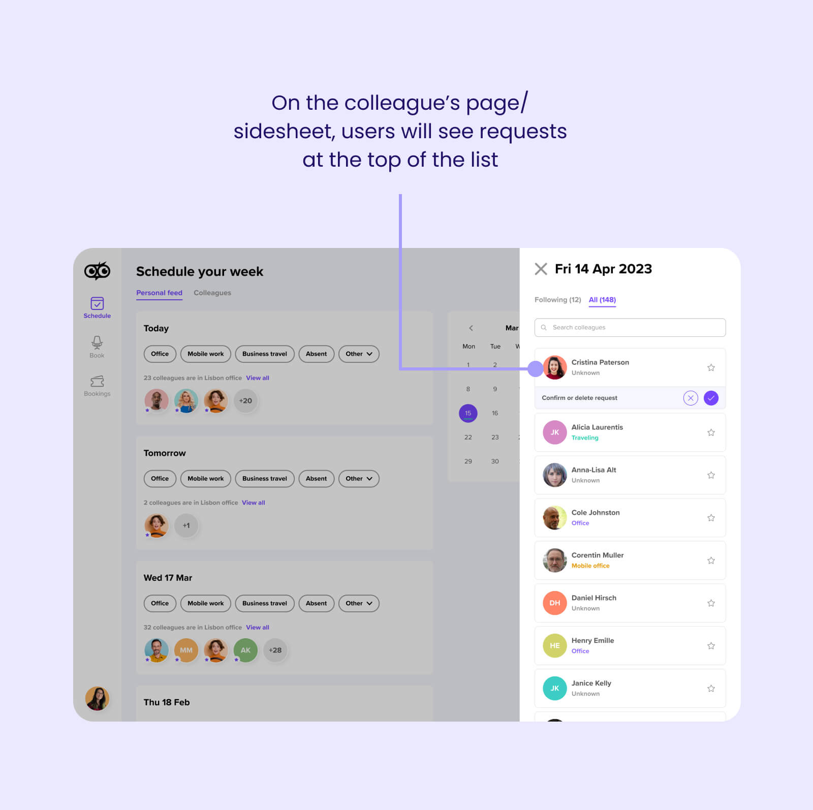
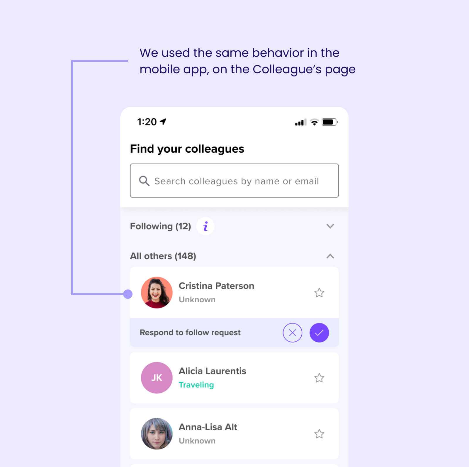
Where would users expect to be able to respond to requests?
How much are we able to modify the interface?
Reflecting on the impact
We released the feature with time to spare, and by all accounts, it was considered a success. Here’s what we achieved:
We attributed the successful launch of this feature to:
- Close collaboration between all stakeholders, particularly Development, Product, and Design helped us ensure everyone was aligned on the timing and solution.
- Early planning and technical discussions which helped to uncover potential blockers before even starting the design phase.
- Speaking directly with our German enterprise customers (done by the PM and CPO) gave us direct insights into what it was we needed to solve.
- Using existing architecture and as many existing components helped to cut down development time in order to release on time.
Next steps
While the immediate release was a success, we needed to measure the long-term impact of the changes we implemented. Deskbird is a tool meant to promote engagement and transparency within a company, so we were keen to understand the implications of introducing a feature that did the opposite. Here’s what we wanted to understand: